从啥球不懂到上线两款Demo,我用了210分钟
在我的传统认知里,想要做出一款游戏,怎么说都要花上几天构建关卡,还要花心思打磨,统筹美术资源和音乐。
游戏继续阅读 ↗
游戏里的一个镜头,行业里的一次变化,厨房里的一点经验。兴趣把它们带到这里,设计给它们留出位置。
深蓝灰把页面安静下来。奶白色负责阅读,粉色提示重点和下一步。让图片保持自己的颜色,让判断留在文字里。
页面背景#202D35
内容表面#2B3942
奶白文字#F2EEE4
强调粉色#ED8EAC
辅助文字#AEB9B9
首页、导航和指南大字采用无衬线字。粗字重与紧凑字距建立清楚的第一眼。字体随系统回退,不依赖在线字体。
网站的文章标题与列表标题采用 Georgia / 宋体类衬线字。正文回到常规字号,保留充足行距。两种节奏属于同一个博客。
数值来自在线页面样式;以下示意为指南重排,随展示宽度缩放。
首页左侧交代我是谁、这里写什么。右侧用一张作品呈现审美。两个入口放在简介之后,下一步一眼就能找到。
游戏行业深度洞察,模拟驾驶,跑鞋与厨艺,与AI共同完成。
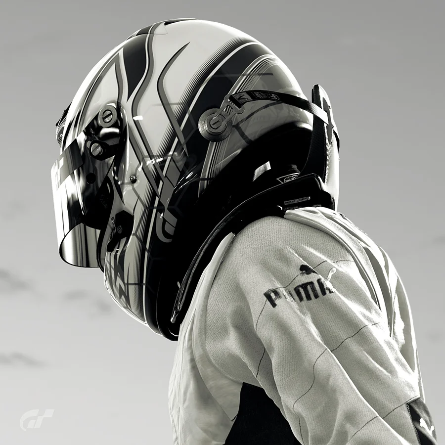
主标题先说清身份。英文小标签保持轻量,不与中文争抢视线。
主体清楚,裁切克制。桌面左右并置,手机上下排列。
粉色实底标记主要动作,线框保留次要选择。
标题与简介为首页原文。此处使用线上首页 Hero 第一张原图;左右箭头与按钮仅展示样式,不切换、不跳转。
一张卡片完成一次判断。日期轻一点,标题明确一点,摘要把读者带到文章真正讨论的地方。
Year、Tag 和 Category 共用同一种阅读顺序。页码保留首尾和省略号,让内容多起来之后仍能辨认位置。
在我的传统认知里,想要做出一款游戏,怎么说都要花上几天构建关卡,还要花心思打磨,统筹美术资源和音乐。
一款游戏是否上头,目前靠的依旧是“人”这一环。
文章标题、日期和摘录来自在线列表,摘录已缩短;分页仅展示样式。
归档把时间之外的路径也留给读者。主题放在上方,篇数退到底部;年份另起一组,旧文章也有清楚的入口。
选取四个真实分类演示,篇数为 2026 年 10 月 27 日所见,不会自动更新。
内容从宽阔的首页进入收窄的正文列。日期、标题、段落和小标题各有层级。目录在需要时出现,手机端把位置留给文章。
游戏里总有一些时刻,会让人暂时忘记任务。也许是一束光,也许是赛道尽头的弯角。按下快门之后,这些细节才有了被重新观看的机会。
这里留给一段具体的观察:画面里有什么,视线落在哪里,为什么这个瞬间值得保存。图片跟着段落出现,图注交代作品和场景。
一段文章可以从很小的经验开始。把对象讲明白,把判断的来由写清楚,读者就有了继续讨论的依据。
本框为新写的版式演示,并非已发表文章。右侧目录沿用线上文章的竖线与无边框悬停抽屉样式,缩放到展示卡片内;目录项仅展示,不执行定位,手机端隐藏。
社交入口以网站使用的品牌标识展示;图标保留悬停高亮,不提供跳转。
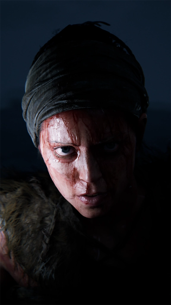
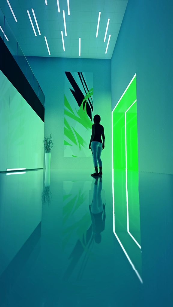
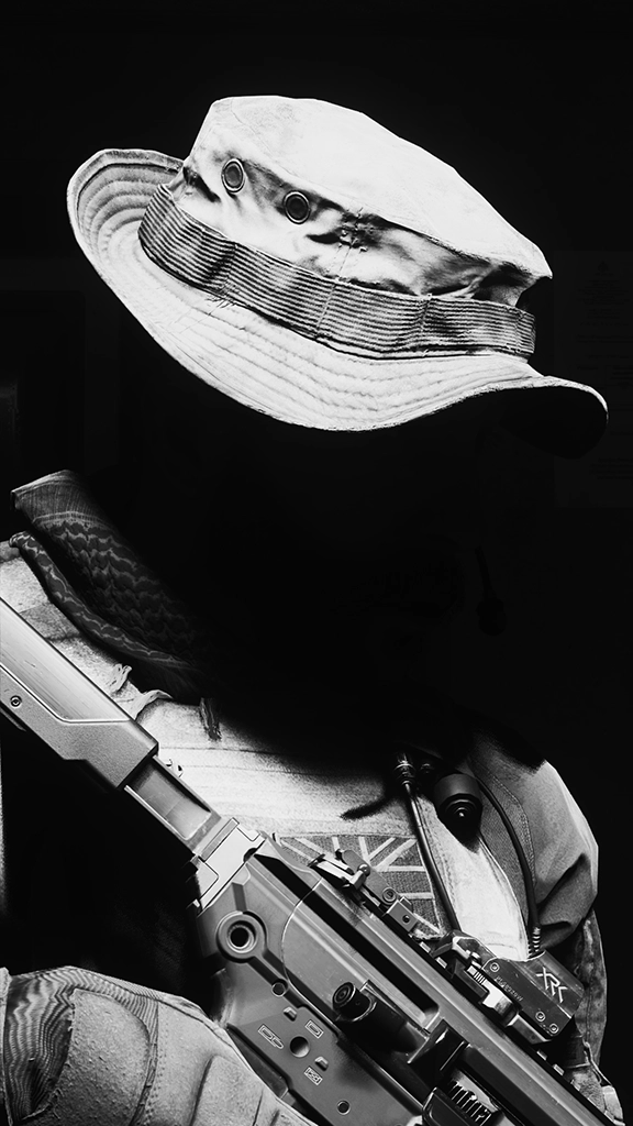
图片直接取自博客作品集并内嵌,非页面截图。选三张说明网格关系;英文标题加粗,边框悬停变粉。这里不设置点击放大。
按钮、链接、边框和加载提示共用一种粉色。反馈短促,位置稳定。让读者看得出能做什么,也知道操作已经发生。
主要动作使用粉色实底,触控区域保持足够大小。
次要动作使用粉色线框,与主入口保持层级。
文字链接用粉色提示,悬停时加强反馈。
加载阶段用简单提示填充内容区域,减少未完成版式的干扰。
本节示例按钮与链接仅展示默认和悬停样式,不执行跳转。指南支持减少动态效果的系统设置;这不代表全站已完成无障碍审计。
用短句建立节奏,用具体内容支撑判断。保留作者说话时的直接和好奇,把话题说到游戏、工具、生活和亲自做过的事情上。
以爱好驱动。把观察写具体。
先读一段,再决定留下。
沿着兴趣,找到下一篇。
停一下,看见画面里的细节。
本节为新拟指南文案,可直接用于后续介绍。写作顺序:一个具体对象 → 一个观察 → 判断的依据 → 一个清楚的入口。
保留这套颜色、层级和留白。换一张图,写下一条观察,就能继续扩充这个博客的视觉语言。
基于 2026 年 10 月 27 日在线页面与公开样式整理。色值、字体和宽度取自网站;本指南的展示排版、新拟短句与演示文章为衍生设计。页面和组件由 HTML/CSS 构建;首页 Hero 原图与作品集摄影均已内嵌,可离线打开。示例控件仅展示样式。
A frame from a game. A shift in an industry. Something learned in the kitchen. Curiosity brings them here. Design gives them room.
Blue-grey settles the page. Cream carries the reading. Pink marks a point of interest or the next step. Images keep their own colours; the writing carries the argument.
Page background#202D35
Content surface#2B3942
Cream text#F2EEE4
Pink accent#ED8EAC
Secondary text#AEB9B9
The homepage, navigation and display copy use the same sans-serif stack. Bold weights and close spacing make the opening clear. System fallbacks keep the file independent of online fonts.
Article and list titles use Georgia, with Songti-family fallbacks for Chinese. Body copy returns to a quieter scale with generous leading. Both rhythms belong to the same blog.
Values come from the live site. Specimens below are recomposed for this guide and scale with the available space.
The homepage introduces the author and the subjects on the left, then gives a piece of work the right-hand side. Two clear choices follow the introduction.
游戏行业深度洞察,模拟驾驶,跑鞋与厨艺,与AI共同完成。
The headline states the identity. A small English label supports it without competing with the Chinese title.
Keep the subject clear and the crop considered. Place image and copy side by side on desktop; stack them on mobile.
Solid pink marks the primary action. An outline keeps the secondary choice quieter.
The Chinese title and introduction are quoted from the homepage. This is its first Hero image. Arrows and buttons demonstrate appearance only; they do not navigate or change the image.
A card gives the reader enough to choose. A quiet date, a clear title and a useful excerpt point towards the actual subject of the article.
Year, tag and category views share the same reading order. Pagination retains the first and last pages, with an ellipsis to keep a growing archive navigable.
在我的传统认知里,想要做出一款游戏,怎么说都要花上几天构建关卡,还要花心思打磨,统筹美术资源和音乐。
一款游戏是否上头,目前靠的依旧是“人”这一环。
Titles, dates and shortened excerpts are quoted from the live list and remain in Chinese. Pagination is a visual specimen.
The archive offers routes beyond chronology. Topics sit at the top of each tile; article counts recede to the bottom. A separate year group keeps older work within reach.
Four live categories are shown in their original language. Counts reflect 27 October 2026 and do not update automatically.
The wide opening gives way to a narrower reading column. Date, title, paragraphs and subheads have distinct roles. The contents drawer appears when needed; mobile gives that space back to the text.
Some moments in a game make the objective fade for a while. A shaft of light, perhaps, or a corner at the end of a circuit. Pressing the shutter gives those details a chance to be seen again.
Use this space for a specific observation: what is in the frame, where the eye settles, and why this moment is worth keeping. Place images beside the relevant passage; let captions identify the work and scene.
An article can begin with a small experience. Name the subject and explain how the judgement was reached. That gives the reader something concrete to discuss.
This is original demonstration copy, not a published article. The contents drawer adapts the live site’s vertical rail and unframed hover panel to this card. Entries are visual only; the drawer is hidden on mobile.
Social identities use the site’s brand marks. Hover highlights remain; links are inactive.
These embedded photographs come from the blog’s portfolio, not screenshots of its pages. Three works demonstrate the grid; mobile shows two. Titles are bold, borders turn pink on hover, and images do not open in a lightbox.
Buttons, links, borders and loading indicators share one pink accent. Feedback is brief and positions stay steady, making actions and responses easy to recognise.
Primary actions use solid pink and a comfortably sized touch target.
Secondary actions use a pink outline to preserve hierarchy.
Pink identifies text links; hover strengthens the feedback.
A simple loading indicator holds the content area while the page is being prepared.
These controls demonstrate default and hover states only. They do not navigate. This guide respects reduced-motion preferences; it is not an accessibility audit of the whole site.
Short lines establish a rhythm. Specific observations support the judgement. Keep the author’s directness and curiosity, grounded in games, tools, everyday life and things tried first-hand.
Follow a curiosity. Make the observation specific.
Read a little. Decide to stay.
Follow an interest to the next article.
Pause. Notice what is in the frame.
These lines were written for this guide. Start with a concrete subject, add an observation, explain the reasoning and offer a clear way forward.
Keep the colours, hierarchy and breathing room. Change an image and write down an observation. The same visual language can carry the next piece of work.
Based on the live pages and public styles observed on 27 October 2026. Colours, font stacks and widths come from the site. The guide’s composition, new copy and demonstration article are adaptations. Layouts use HTML/CSS, with the original Hero image and portfolio photographs embedded for offline use. Specimen controls are visual only.